
19
Feb
What Colours Are Right For Your Brand?
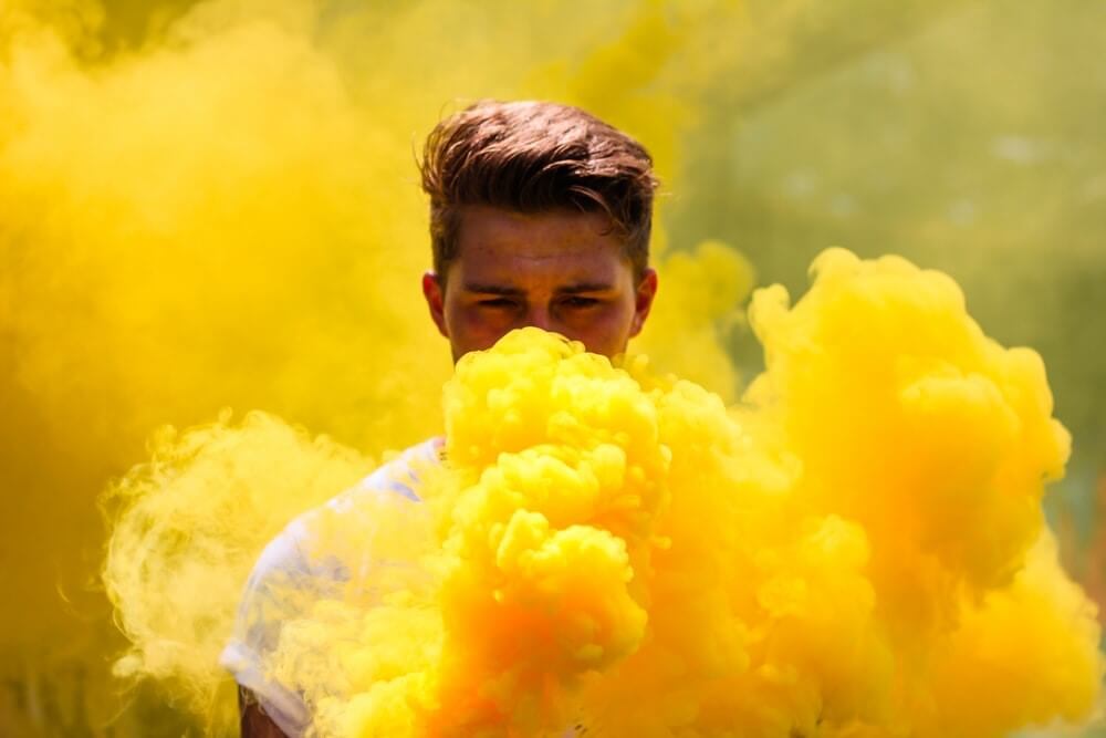
Have you thought about how colours affect you? Do you tend to feel uplifted when you see the colour yellow? It is what it is because colours reflect light and symbolise energy, and interplay with the state of mind. As a business owner, understanding colour psychology is paying it forward!
How are colours important?
Research (colourcom.com) reveals that people make a subconscious judgment about an environment, or a product within 90 seconds of initial viewing and that up to 90% of that assessment is based on colour alone.
Colour also increases brand recognition by 80% (quicksprout.com). Brand recognition is directly tied to consumer confidence.
Data aside, let’s dive into 3 reasons why colours are important!
1. Colours evoke an emotional response
Colours are everywhere you look, and in nooks and crannies that you don’t venture. It has an impact on mood. It influences perceptions, and it can arouse desire, engender sub-conscious feelings and prompt decisions.
2. Colours have a persuasive effect on consumer behaviour
According to Neuromarketing, “If a good colour sells, the right colour sells better”. Colours have a bigger impact, more than words and visuals, when it comes to piquing your audience’s interests, creating a positive or negative experience, and improving conversion rates.
3. Colours influence how customers perceive and relate to your brand.
Understanding colour psychology helps you predict how your audience will react to your marketing copy or messages, and hence enable you to adjust your copy pre-emptively.
Despite the above, it’s important to remember that colours are not universal. It is culture-specific. In Latin America, yellow represents death and mourning, while in Germany, it represents jealousy and envy.
What colours are right for your brand?

We love to give you an answer. But, the reality is, “It depends”.
- The right colour is interactive and context-dependent
We all heard this at one point: dressing for success. Put on a snatched outfit and you instantly feel like a new person. Just as colours interact with body shapes and skin shades to conjure a flattering hue, Matching the right colour for your brand purpose can be the difference between standing out and blending into the crowd.
Questions to help you decide:
- Is the colour appropriate for the service/ product you are marketing, and taking into account your brand personality? This is called the notion of congruity.
- What would be your audience’s reaction when they see the colour on your brand?
In colour psychology, orange represents creativity, adventure, enthusiasm, success, and balance. Universally, blue is often taken to symbolise harmony, peace, calm and trust. Translating this to colour branding, if you’re an active wear label, you may like to go for orange. But, if you are a yoga brand, then blue may be more appropriate.
- The right colour accentuates your brand personality
Colours have cultural connotations, and can evoke different emotions depending on colour pairing. There are, however, some trends in the colour choice based on industry:
 |
 |
 |
- Food: Many food businesses prefer warm colors that draw attention and evoke appetite, such as red, orange and yellow. But, if you are a wellness brand, blue or green may help to denote clean consumption, promote connection with nutrition and holistic well-being.
- Fashion/Beauty: This industry may opt for pink as this colour resembles love, tenderness, and feminine appeal. Or, go for black and purpose for sophistication and glamour.
- Entertainment: Mega brands like Disney and Pixar love having a unique set of colors. Disney’s princesses, adventurers, and villains all have a designated colour scheme meant just for them.
- The right colour isolates your brand
A distinctive visual structure makes your brand stand out and gives it higher recall among competing brands. Misty jade, Dusty pink, Provence and Cornhusk are innovative shades of green, pink, blue and brown as we traditionally know.
You may want to step apart from your competition by relying on a blend of mostly primary colours. Google, Microsoft and eBay are well-known rare exceptions to the unwritten rule that a mixture of colours can dilute or harm your brand image. Some have said that this is a nod to the brand’s ethos of non-conformity and diversity.
Create your unique palette
Keep in mind that no one colour works best, and it’s best to experiment before deciding. But, once you choose the colour scheme, be sure to carry it through all your platforms.
We hope the above principles give you some ideas to think about which colour best suit the personality you want to establish for your brand, and convey the message to your audience. Stick to your true colours and we are more than happy to help your construct your unique palette!
Recent Posts

40 Reasons Why Social Media Marketing is Important
October 14, 2022

Understanding Social Media KPI’s
October 11, 2022

How Can Social Media Improve Your Seo?
October 7, 2022

7 Things You Should Know About Linkedin Advertising in 2022
October 5, 2022

15 Tips for B2b Social Media Marketing
October 1, 2022
You may also be interested in
14
Oct
40 Reasons Why Social Media Marketing is Important
11
Oct
Understanding Social Media KPI’s
07
Oct